PAYPER

Expense Review

Expense Review

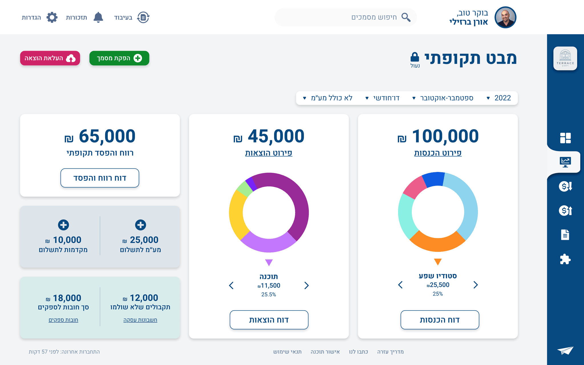
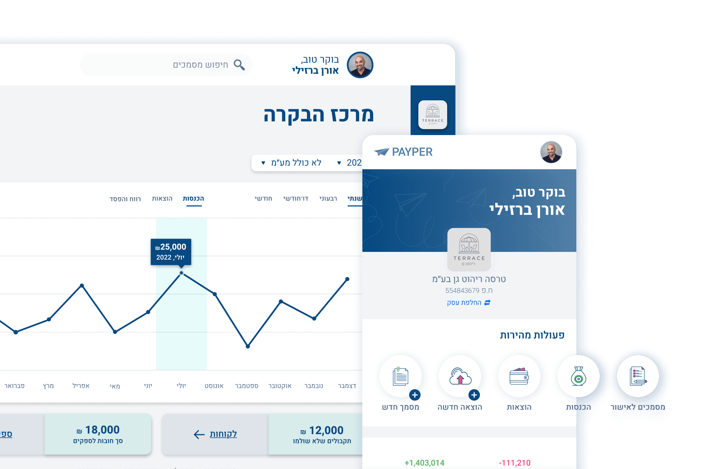
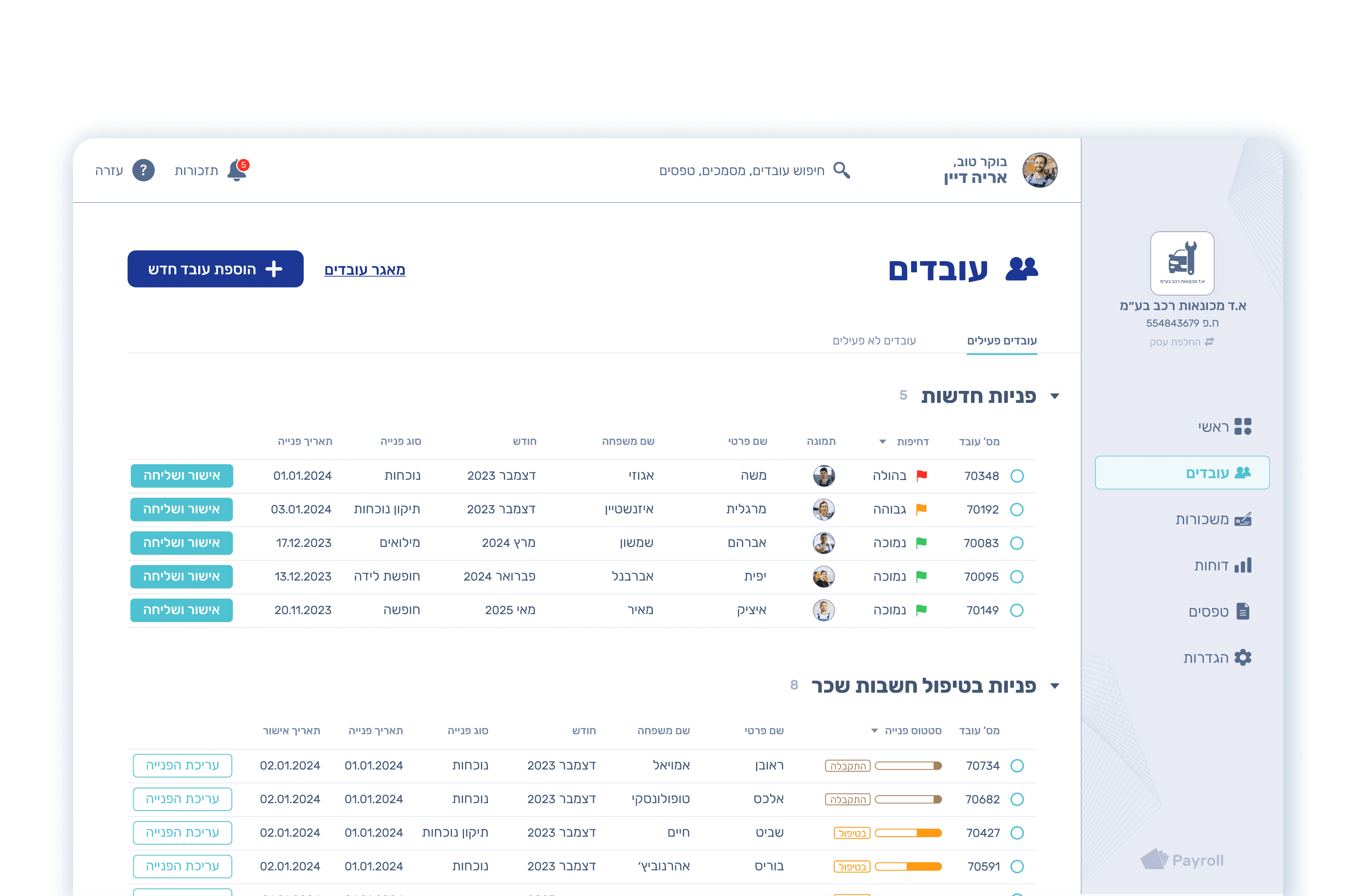
PAYPER is a B2B SaaS accounting software that offers digital invoicing and financial business management services for small businesses and freelancers.

Payper preview screens

Role

Lead Product

Designer

Responsibilities

Mobile Redesign

UX Research

UI Design

Prototyping

Usability Testing

Client

Pay Investments

Timeline

Nov '21 - Jun '22

Problem Statement

Most PAYPER users prefer to upload their expenses using the desktop version, even though the mobile version is easier and faster.

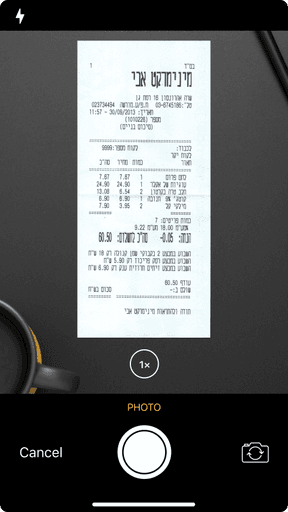
long bill receipt
long bill receipt
long bill receipt

What made PAYPER stakeholders

hire my services?

Mobile

Decrease

52.78%

Desktop

Increase

30.16%

100%

80%

60%

40%

20%

0%

63%

36%

24.06.21

82%

17%

30.10.21

Desktop

Mobile

Other

Mobile

Decrease

52.78%

Desktop

Increase

30.16%

100%

80%

60%

40%

20%

0%

63%

36%

24.06.21

82%

17%

30.10.21

Desktop

Mobile

Other

Mobile

Decrease

52.78%

Desktop

Increase

30.16%

100%

80%

60%

40%

20%

0%

63%

36%

24.06.21

82%

17%

30.10.21

Desktop

Mobile

Other

PAYPER's stakeholders aimed to enable mobile users to upload expenses easily. They even developed an MVP mobile app version.


However, they noticed that the mobile retention rate had dropped by one-half despite the availability of a simple mobile solution.

Diagram
Diagram
Diagram

KPI

Increase mobile user retention rate from the current 17% to at least 30% within the next quarter.

target
target
target

Objectives

Redesign the MVP with a mobile adaptation of the Document Review feature.

Increase ROI by streamlining the upload expenses process.

mountains with flags

Challenges

On-the-go mobile app needs to be compatible with fast tasks.

Smooth transition for users due to the app's significant changes and redesign.

Discover

01

User Research

User Research

Observations - User Behaviors

Observations - User Behaviors

Observations -

User Behaviors

We began user research using Microsoft Clarity to observe the behavior of 20 users at various points during their workday for one week.

We found that most users prefer uploading their expenses using the desktop version, even though the mobile version is easier and faster, simply because the desktop version provides a single platform for uploading and reviewing their expenses.

The primary task under evaluation was:

The primary task under evaluation was:

+

1. Upload and review one expense

via mobile (upload) and desktop (review)

1. Upload and review one expense via mobile (upload) and desktop (review)

2. Upload and review one expense

via desktop (upload and review)

2. Upload and review one expense via desktop (upload and review)

Main Persona

OREN
OREN
OREN

Oren Barzilai

Small Business Owner

Background

Oren is the owner of an outdoor furniture store. He has many financial tasks during the day. One of the tasks is to upload and review business expenses.

Goal

Streamline administrative tasks to focus more on sales and customer service.

Pain Point

Uploading expenses using the mobile app and reviewing them on the desktop creates an inefficient workflow.

Need

Ideally, one platform should be used for uploading and reviewing business expenses.

Goal

Streamline administrative tasks to focus more on sales and customer service.

Pain Point

Uploading expenses using the mobile app and reviewing them on the desktop creates an inefficient workflow.

Need

Ideally, one platform should be used for uploading and reviewing business expenses.

Original Design Analysis

Original

Design Analysis

Before redesign

old payper screen
old payper screen
old payper screen

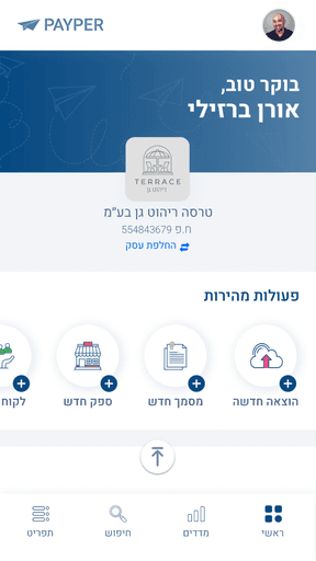
Homepage

Identical CTA buttons

Similar icons without text make it difficult for the user to understand

UI errors

Lack of grids, random color choices, flat UI structure with no hierarchy

Ineffective IA

The search bar as the main section on the home screen is not the ultimate UX for this app's users

old payper screen
old payper screen
old payper screen

Document Upload

Microcopy

Gender-specific language that could be offensive to some users

Interactive Issues

Elements that lack visual indicators confuse users as to whether they are clickable

Desktop version

Before redesign

old payper screen
old payper screen
old payper screen

Document Upload Process

Competitive Analysis

Competitive

Analysis

Morning Logo
Morning Logo
Morning Logo

Strengths

Upload expenses CTA

User-Friendly Interface

Easy expense upload

Weaknesses

Missing features in the App

Customer service

Bills should still be kept

for records

icount Logo
icount Logo
icount Logo

Strengths

Microcopy

User-Friendly Interface

Easy expense upload

Weaknesses

Hidden expenses button

Missing features in the App

Bills should still be kept

for records

finbot Logo
finbot Logo
finbot Logo

Strengths

Upload expenses CTA

User-Friendly Interface

Scalability

Weaknesses

Aimed at accountants

Missing features in the App

Bills should still be kept

for records

Ideate

02

Solutions

הוצאה חדשה

הוצאות

מסמך חדש

הכנסות

UX solutions

Document review feature

Design new IA

Gender-neutral UX writing


UI solutions

CTA buttons with icons and text

Design system

Empty states

Micro-interactions

PAYPER mascot

UX solutions

Document review feature

Design new IA

Gender-neutral UX writing


UI solutions

CTA buttons - icons and text

Design system

Empty states

Micro-interactions

PAYPER mascot

Information Architecture

Information

Architecture

Payper IA before and after

Sketching

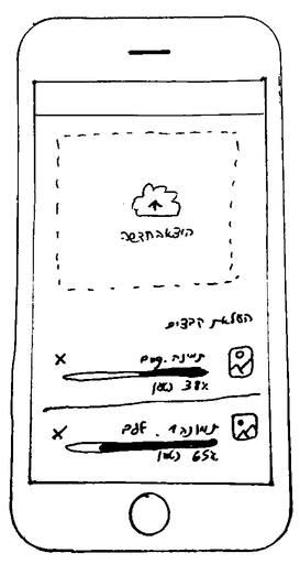
Payper sketch upload expenses

Document Upload Process

The "Upload Expenses" section was changed to a CTA button

The "Document Upload Process" section was transformed into a stand-alone screen

Payper sketch upload expenses

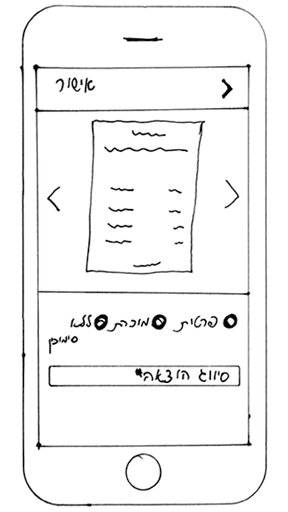
Document Review

At this point, we did not consider the issue of very long receipts

Design

03

Design System

Design System colors
Design System typography
Design System iconagraphy
Design System colors
Design System typography
Design System iconagraphy

User Flow

Flow 1: Upload

Before redesign

old payper screen
old payper screen

Homepage

old payper screen
old payper screen

Document Upload

After redesign

New payper screen
New payper screen
New payper screen

Homepage

New payper screen
New payper screen
New payper screen

Document Upload Modal

So, how did we increase

the mobile user retention rate

by 230% with a single feature?


By adding the mobile adaptation

of the Document Review feature.

So, how did we increase

the mobile user retention rate

by 230% with a single feature?


By adding the mobile adaptation

of the Document Review feature.

Check it out

Check it out

Flow 2: Review

New payper screen
New payper screen

Document Upload Process

New payper screen
New payper screen

Document Approval

New payper screen
New payper screen

Document Review

New payper screen
New payper screen

Capture the Document

New payper screen
New payper screen

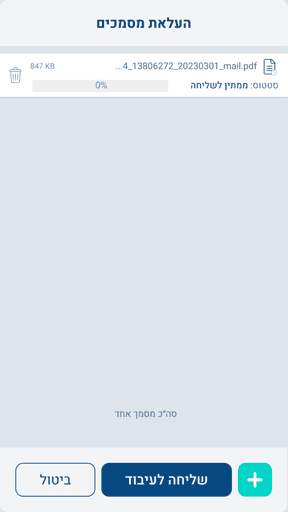
Document Upload Process

New payper screen
New payper screen
New payper screen
New payper screen

Data visualization

The scanning process is available when sending files for AI scanning

File OPS

Upload additional files, delete them, or scan them

New payper screen
New payper screen

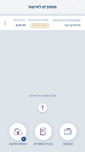
Document Approval

Document approvals

A list of all the files that the user must review and approve

New payper screen
New payper screen
New payper screen

Document Review

Zoom in and out

When users review documents, they will be able to review long receipts easily

New payper screen

Draft option

If for some reason, the user is not ready to submit the document yet, they may save it as a draft

Approval

The user has the option to either approve the document or approve and move on to the next document for a smoother UX

OCR

Automatic image to text

Prototype

Insights

04

Trophy
Trophy
Trophy

Results

User Retention Rate

After redesign

Mobile

Increase

229.41%

Desktop

Increase

47.56%

100%

80%

60%

40%

20%

0%

63%

36%

24.06.21

82%

17%

30.10.21

43%

56%

14.09.22

14.09.22

Desktop

Mobile

Other

Mobile

Increase

229.41%

Desktop

Increase

47.56%

100%

80%

60%

40%

20%

0%

63%

36%

24.06.21

82%

17%

30.10.21

43%

56%

14.09.22

14.09.22

Desktop

Mobile

Other

Mobile

Increase

229.41%

Desktop

Increase

47.56%

100%

80%

60%

40%

20%

0%

63%

36%

24.06.21

82%

17%

30.10.21

43%

56%

14.09.22

Desktop

Mobile

Other

Future Steps

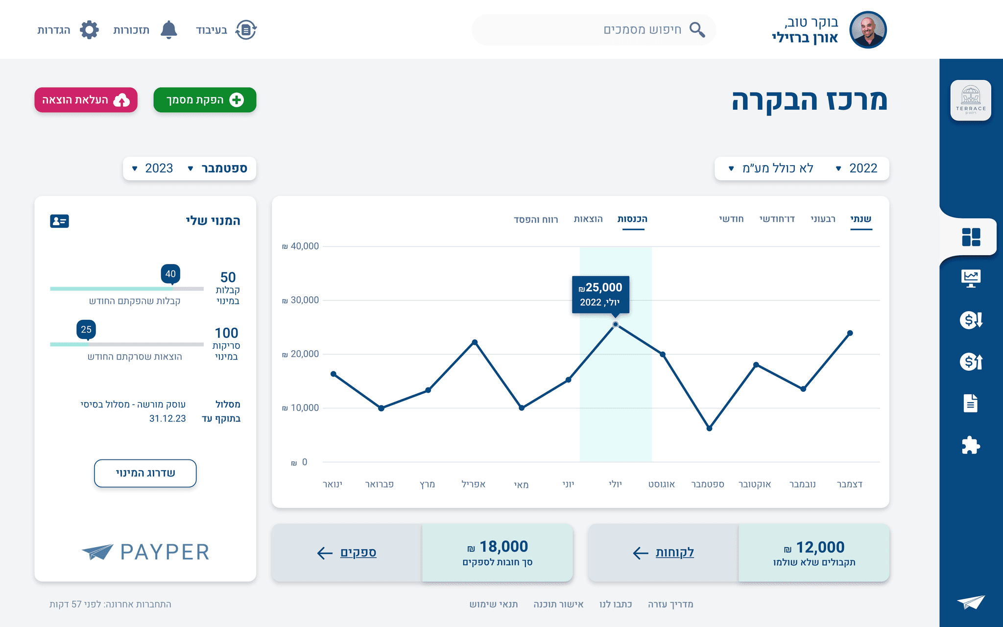
These days, we are working on the PAYPER desktop redesign,

and this is a sneak peek of the high-fidelity wireframe prototype:
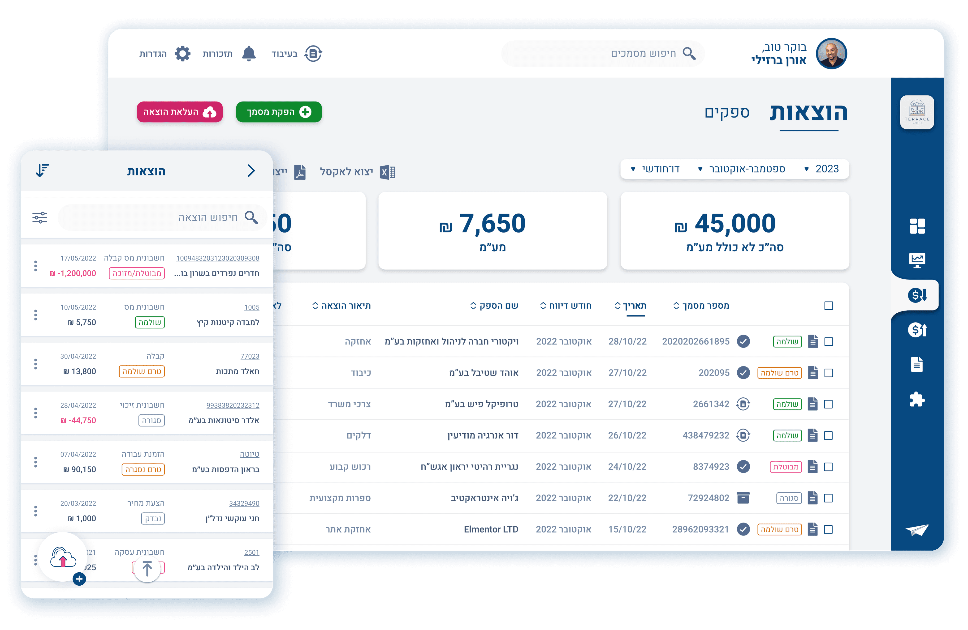
New payper screen desktop wireframe

Final Thoughts

I've learned and evolved both personally and professionally as a lead UX/UI Product Designer during the PAYPER app redesign process. I gained a deeper understanding of the Accounting and Fintech fields.


The most satisfying part is observing in real time how users engage with the redesigned app and how they understand intuitively the tasks they are supposed to do.


Additionally, it has been a great benefit for me to work closely with the PAYPER developer and be familiar with his challenges and limitations. 


It has been a terrific end-to-end experience, and I'm super excited about my next role as a UX/UI Product Designer.