PAYPER
PAYPER is a B2B SaaS accounting software that offers digital invoicing and financial business management services for small businesses and freelancers.
Responsibilities
Mobile Redesign
UX Research
UI Design
Prototyping
Usability Testing
Client
Pay Investments
Timeline
Nov '21 - Jun '22
Team
Tools
Problem Statement
Most first-time PAYPER users find it challenging to navigate the mobile app.
What made the
stakeholders hire my services?
PAYPER's stakeholders hired me to resolve mobile app usability issues, as first-time users struggled with navigation, causing retention to drop.
They needed my expertise to identify pain points and design a more intuitive, user-friendly solution.
KPI
Upload and review one expense in one minute instead of 02:37 minutes.
Over 80% success rate when uploading and reviewing expenses for the first time.
Objectives
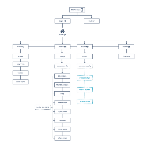
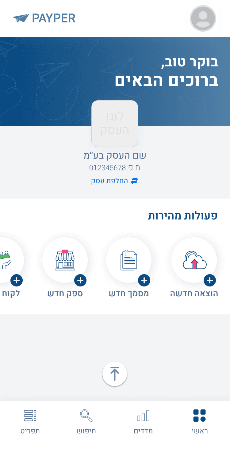
Redesign the MVP with an intuitive navigation menu.
Reorganize the IA.
Challenges
On-the-go mobile app needs to be compatible with fast tasks.
Smooth transition for users due to the app's significant changes and redesign.
Discover
01
We began user research using Microsoft Clarity to observe the behavior of 30 new users at various points during their workday for one week.
We found that most first-time PAYPER users struggle to navigate the mobile app. More than half fail to complete the task, and those who succeed take significantly longer than expected.
+
02:37min
Average duration
42%
Success rate
Strengths
✓ Upload expenses CTA
✓ User-Friendly Interface
✓ Easy expense upload
Weaknesses
✗ Missing features in the App
✗ Customer service
✗ Bills should still be kept
for records
Strengths
✓ Microcopy
✓ User-Friendly Interface
✓ Easy expense upload
Weaknesses
✗ Hidden expenses button
✗ Missing features in the App
✗ Bills should still be kept
for records
Strengths
✓ Upload expenses CTA
✓ User-Friendly Interface
✓ Scalability
Weaknesses
✗ Aimed at accountants
✗ Missing features in the App
✗ Bills should still be kept
for records
Ideate
02
User Flow
Expense Upload
Mobile | First-Time user
Design
03
Screen Flow
Walkthrough
First-Time User
Homepage
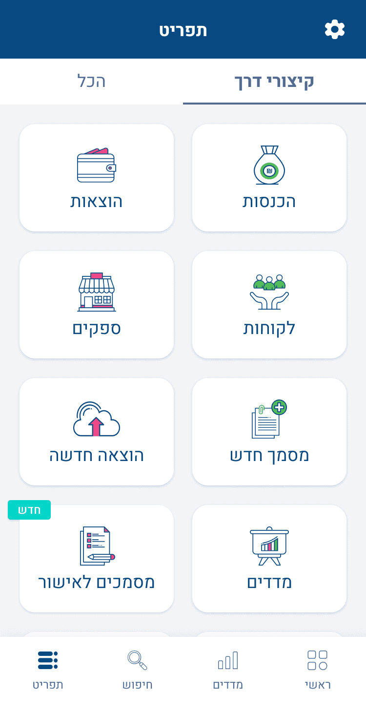
Menu Buttons
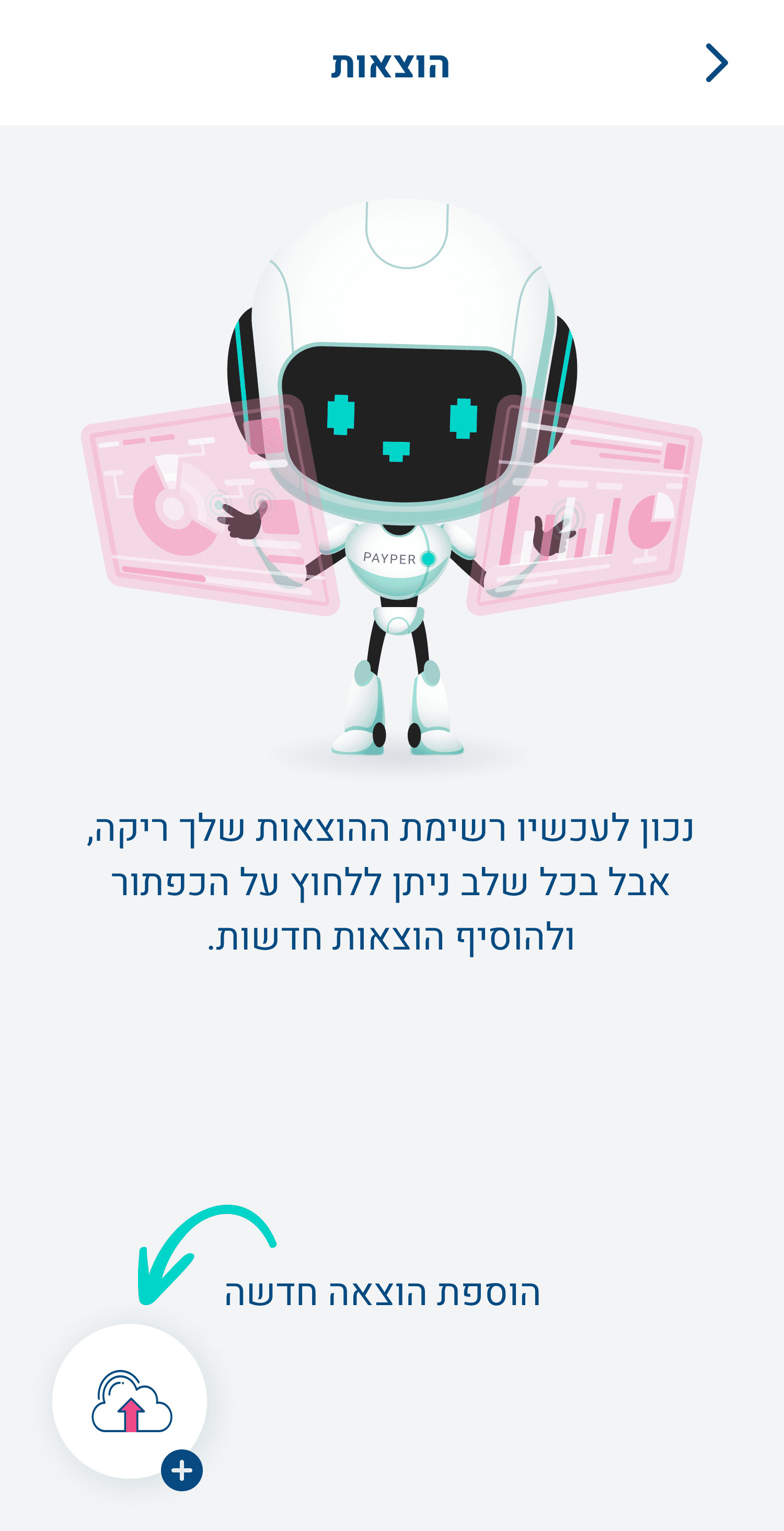
Expenses - Empty state
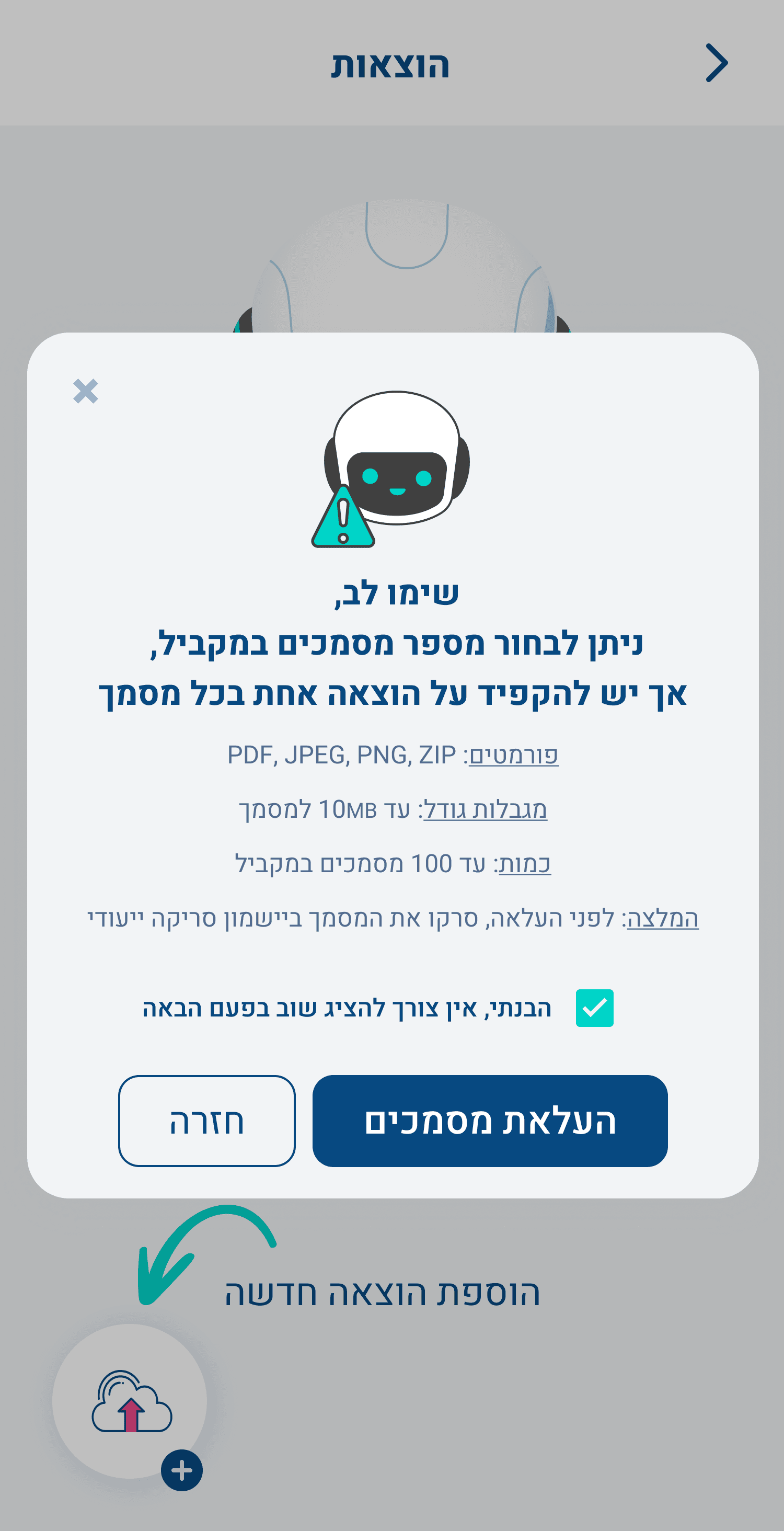
Document Upload Modal
Insights
04
Results
00:46sec
The new average duration
Before:
2:37 min
90%
The new success rate
Before:
42% success rate
Future Steps
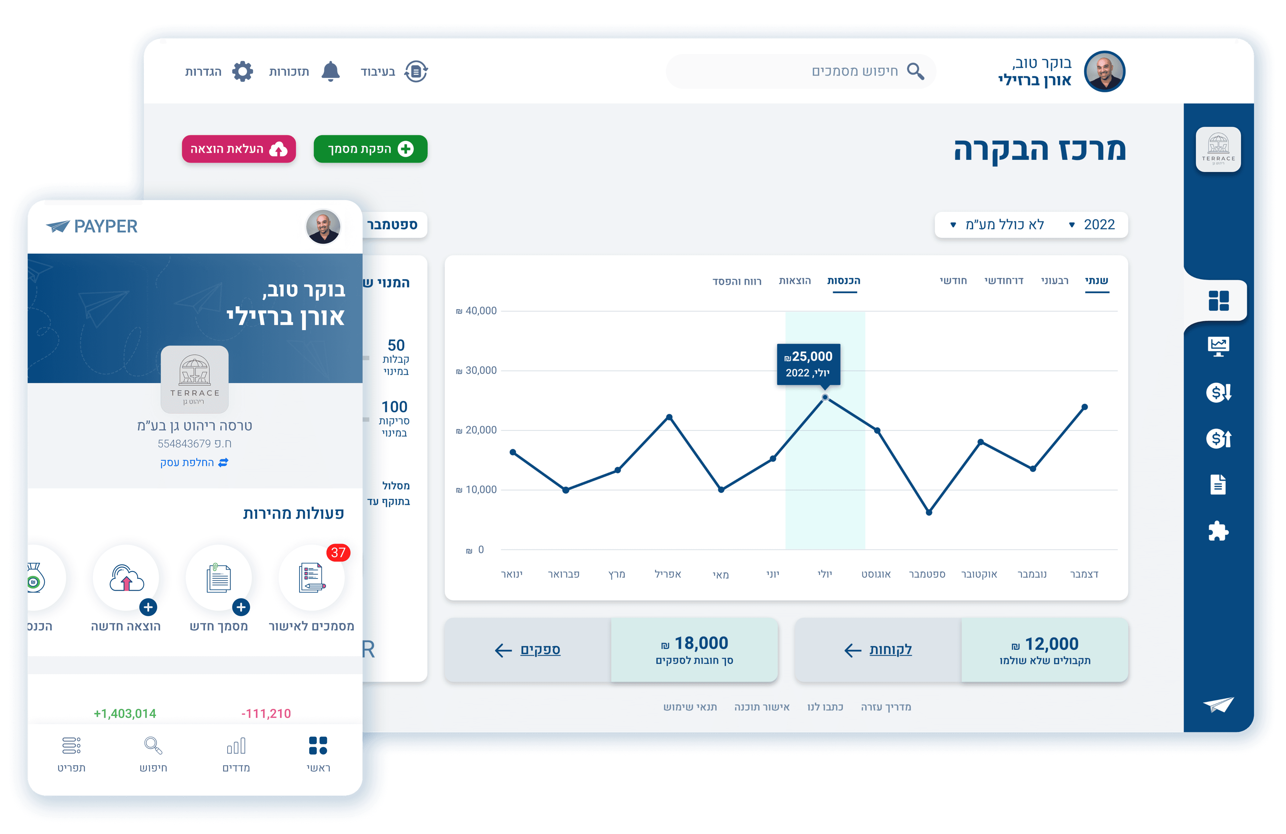
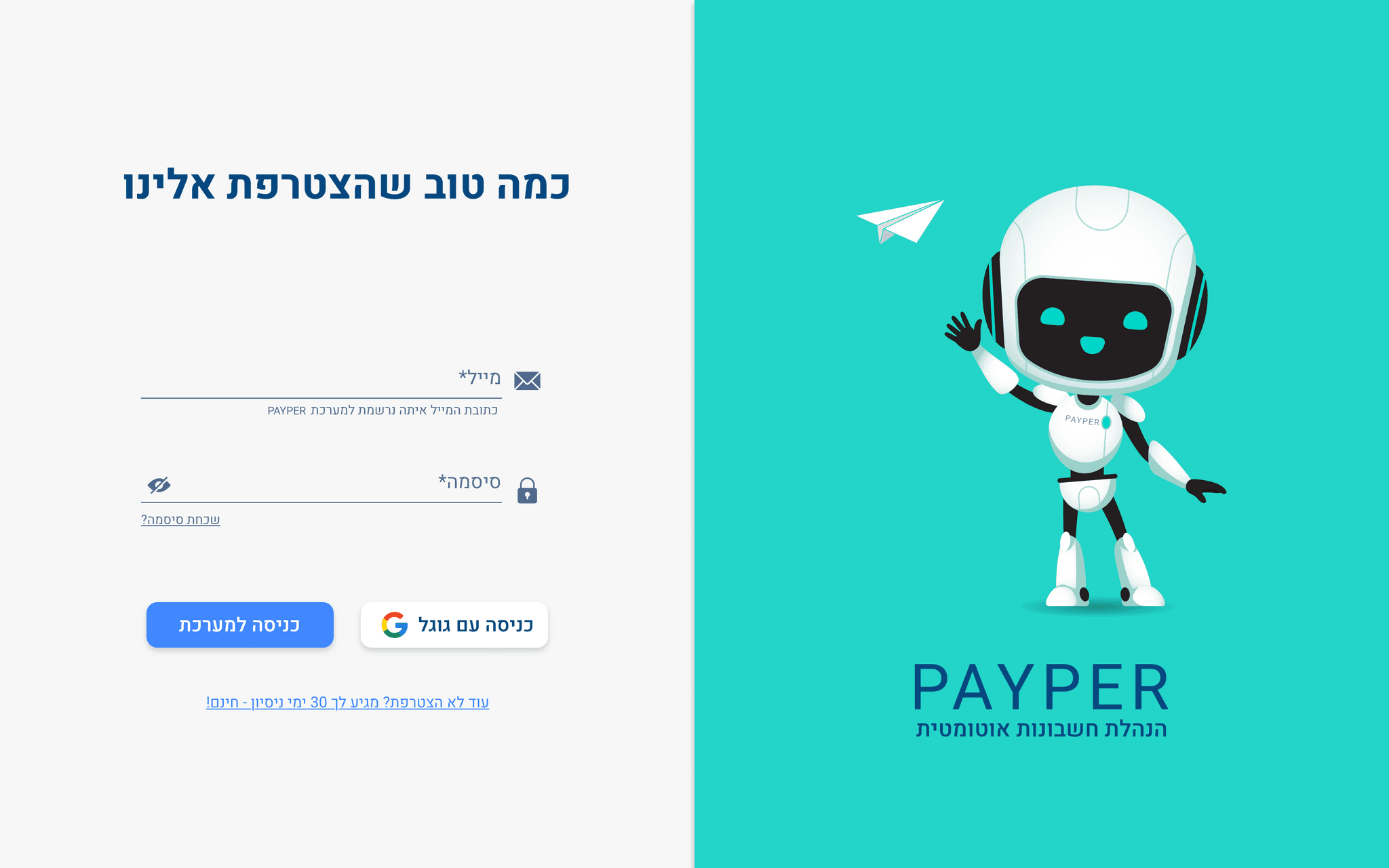
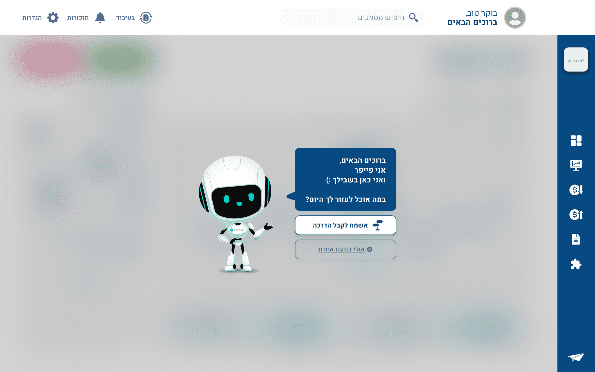
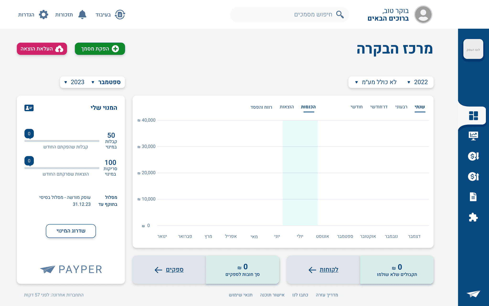
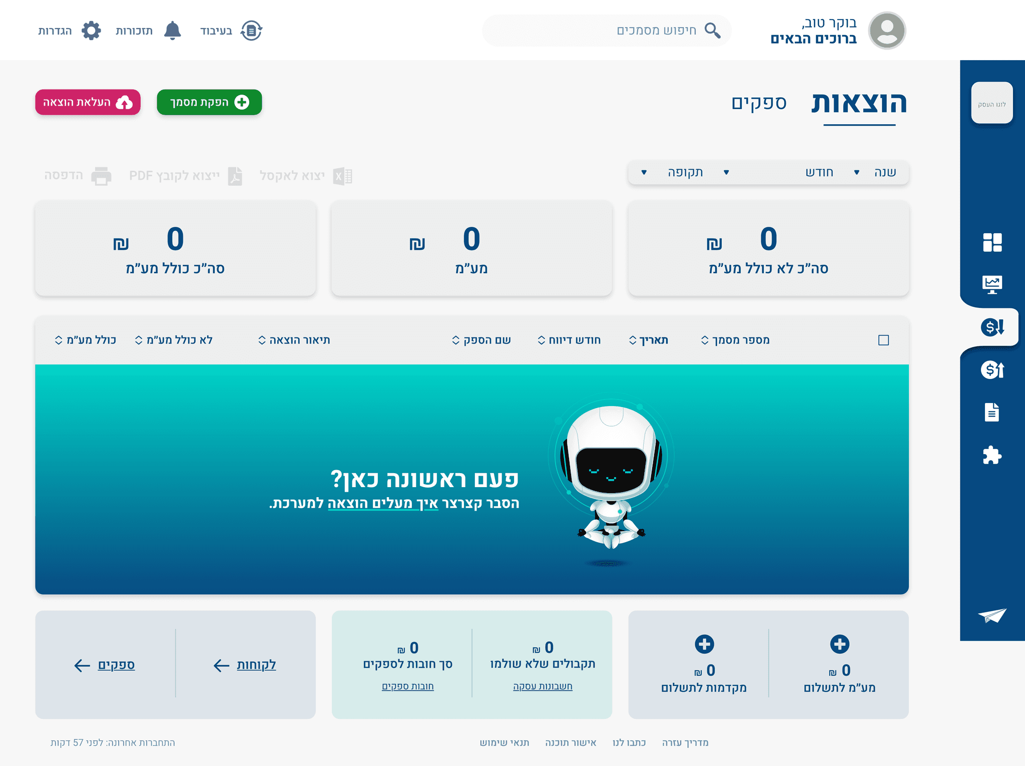
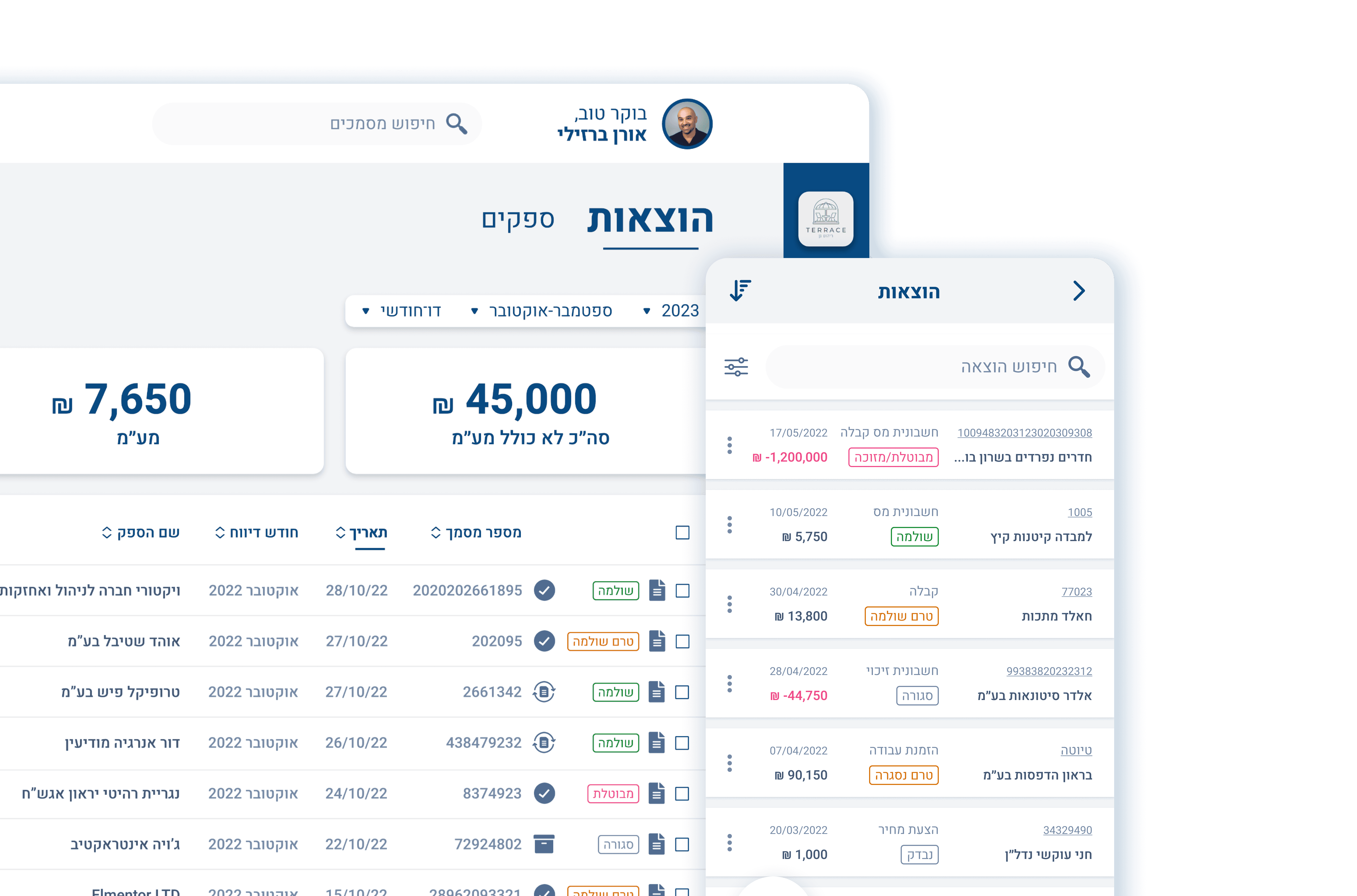
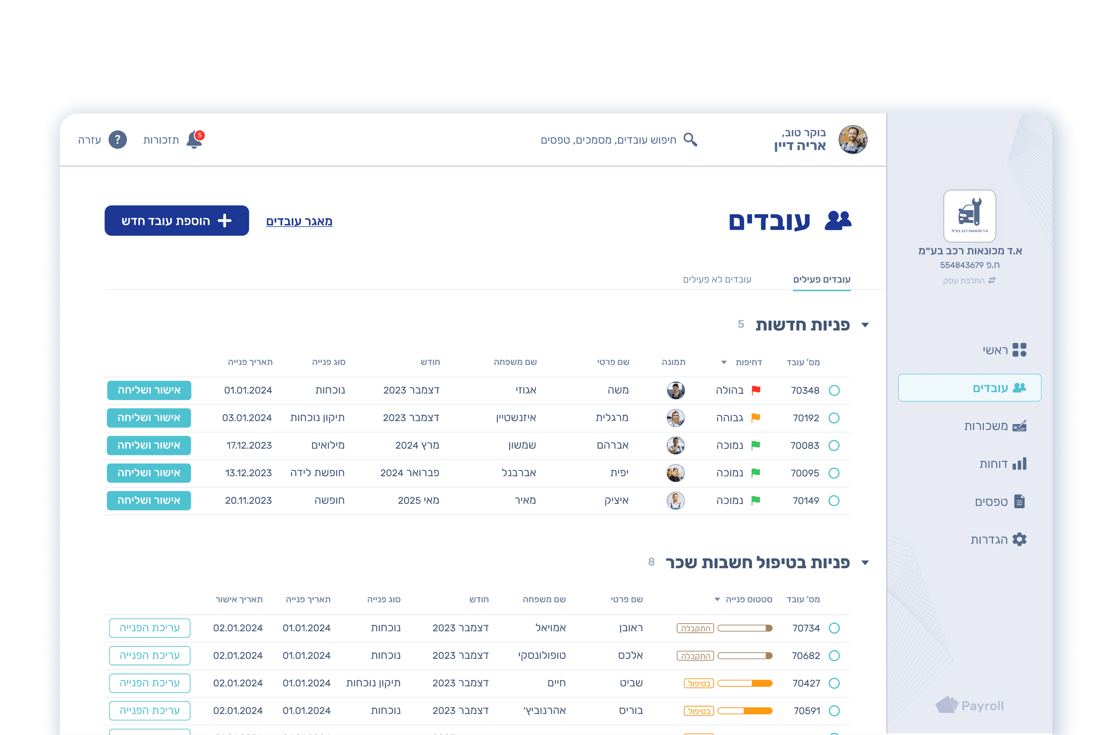
These days, we are working on the PAYPER desktop redesign,
and this is a sneak peek of the high-fidelity wireframe.
